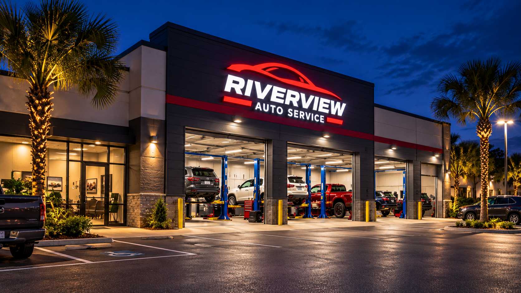
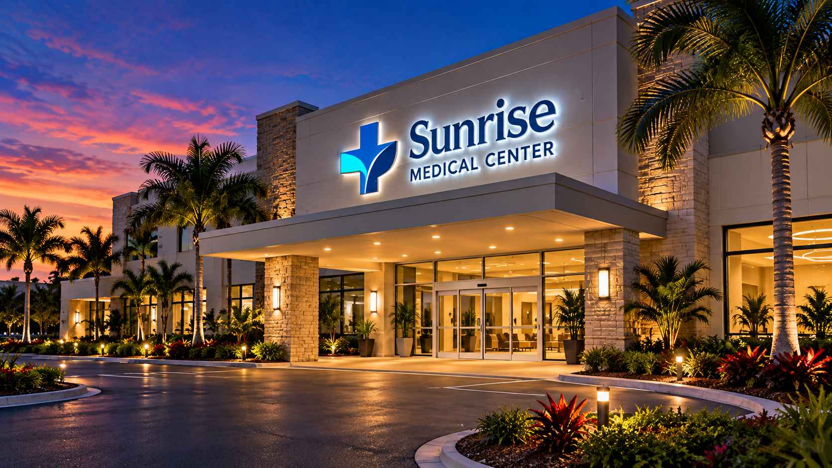
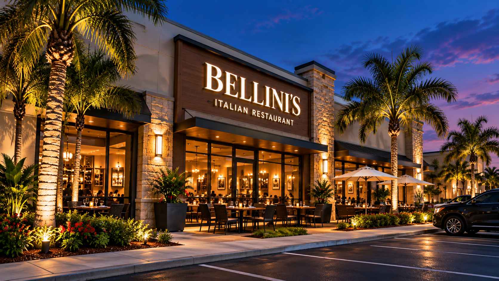
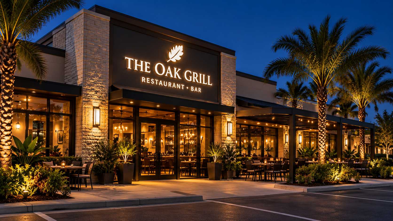
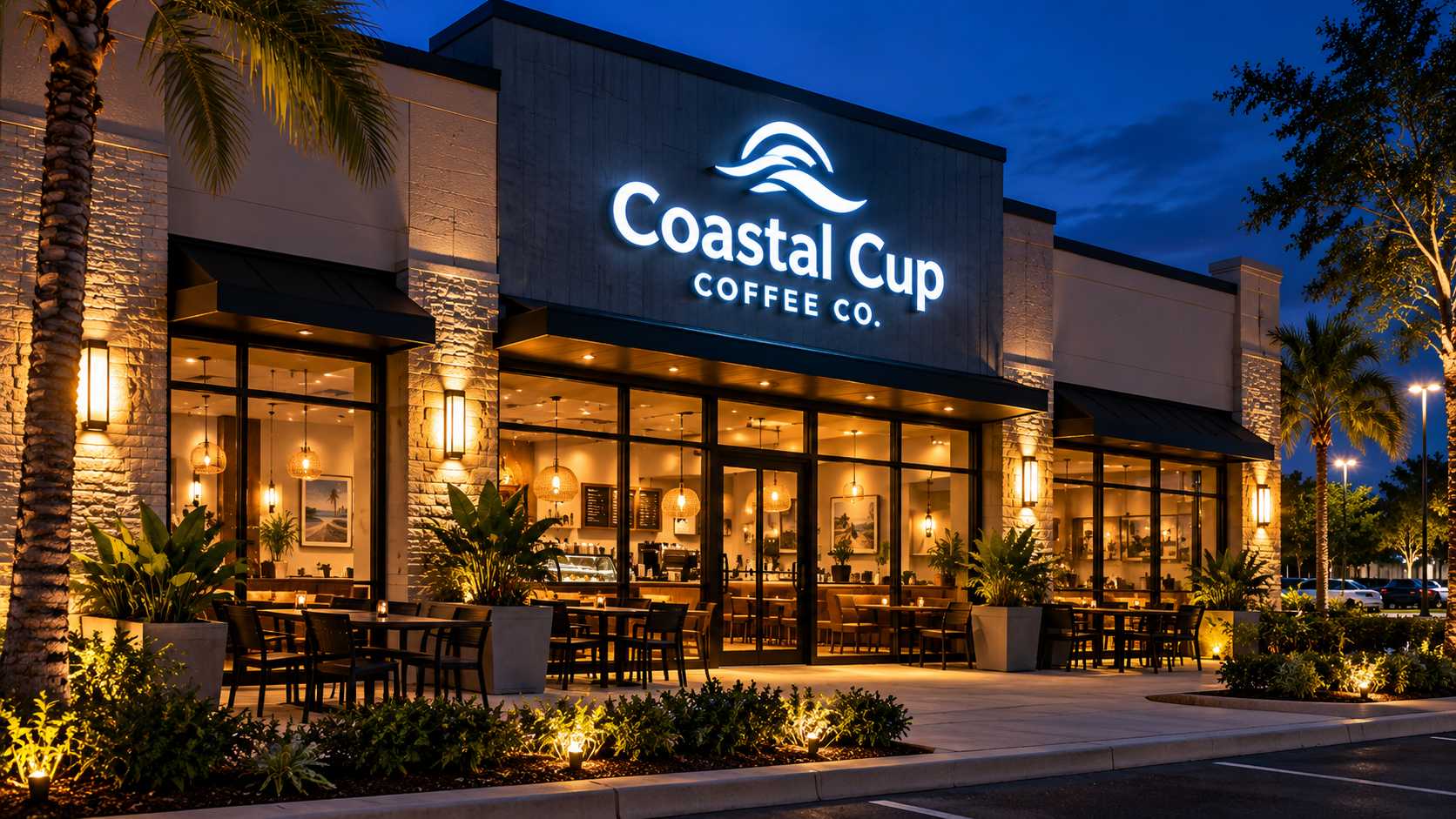
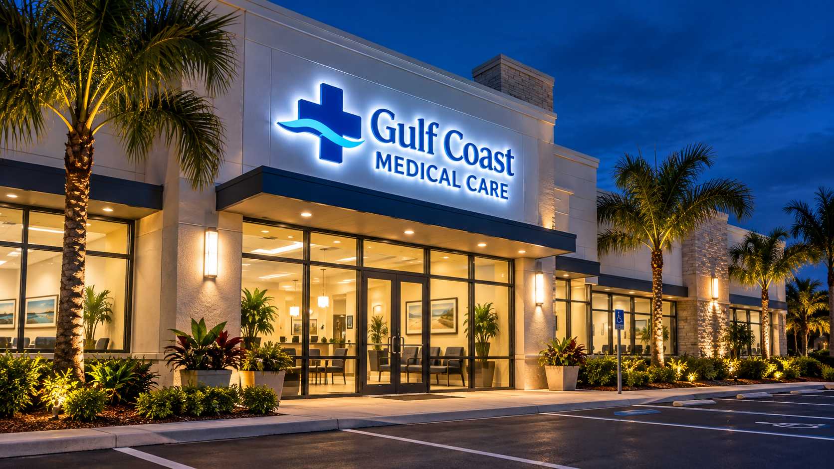
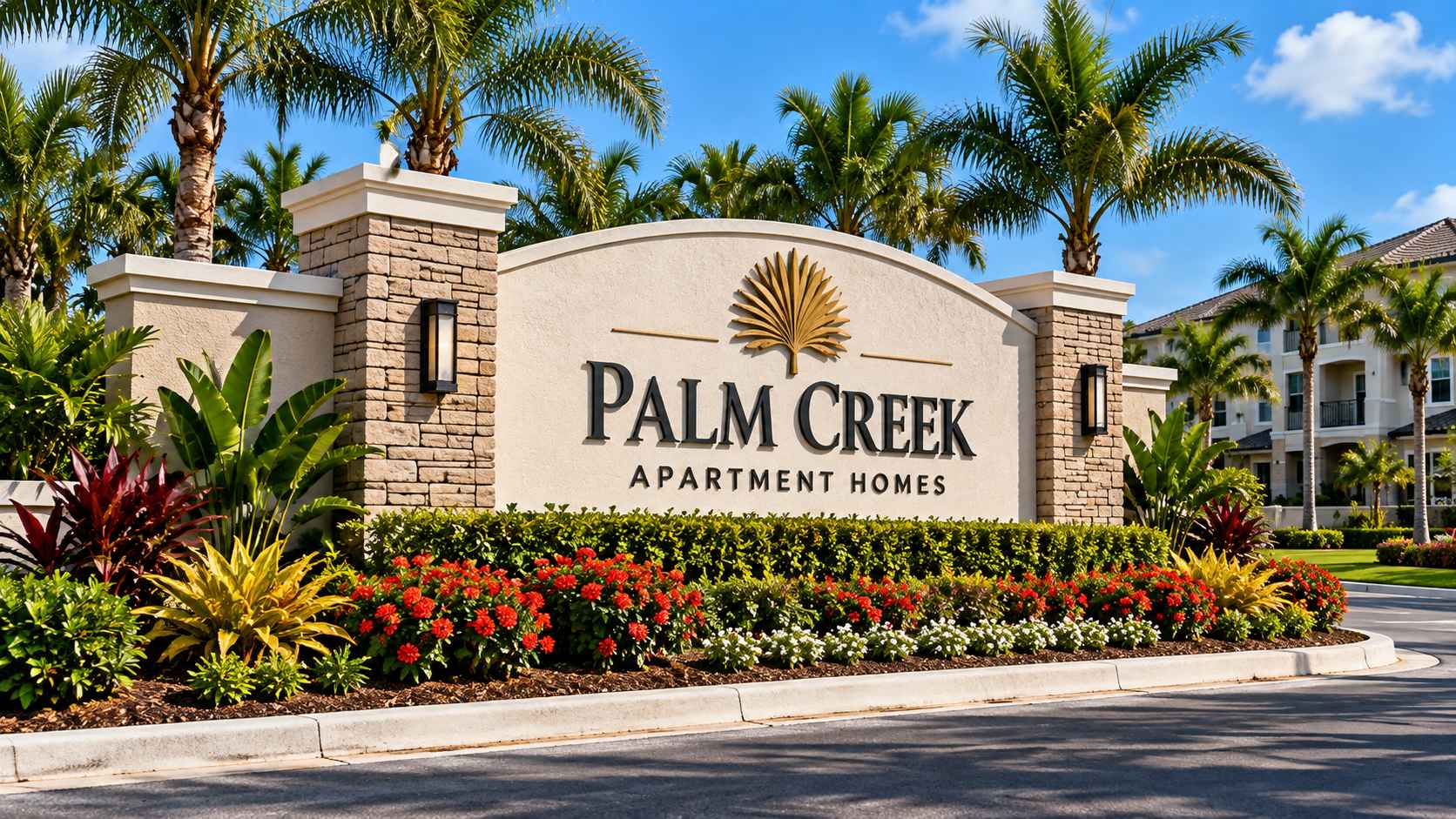
A storefront does not look the same at eight in the evening as it does at two in the afternoon. Once the sun drops, colors deepen, walls lose definition, windows reflect the street, and the sign often becomes the clearest expression of the business itself. For restaurants, bars, entertainment venues, retail stores, and hospitality businesses across Southwest Florida, that evening transformation is more than visual. It can influence whether people notice the business, recognize it from the road, and feel curious enough to stop.
That matters in Fort Myers, Cape Coral, Naples, and the commercial districts that connect them. These are markets where dining, tourism, entertainment, healthcare, retail, and residential growth often share the same streets and shopping centers. During the day, architecture and landscaping help define a property; after dark, commercial signage takes on a much larger role in creating identity. The strongest signs are not simply brighter at night. They are designed to work differently once daylight disappears.
Designing for Daylight and Darkness
A successful exterior sign has to perform in two environments. During the day, people notice the physical qualities of the sign: dimensional lettering, material, finish, color, and the way it sits on the building. At night, illumination becomes more important, while much of the surrounding architecture fades into the background. The same sign can therefore feel calm and architectural in daylight, then much more prominent once the lights come on.
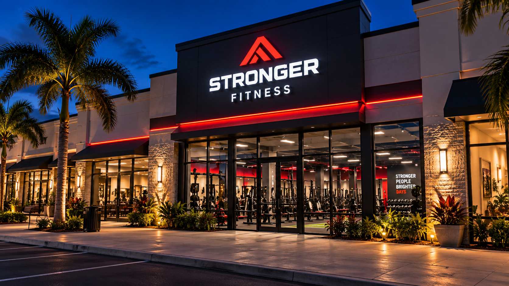
This is one reason channel letter signs remain so common on commercial properties. Individual letters give a storefront shape and depth during the day while internal illumination keeps the business name readable after sunset. Restaurants, bars, retail stores, and professional offices can all use the same basic sign type while creating completely different personalities through typography, color, scale, and lighting.
The key is not to chase brightness for its own sake. A restaurant in Naples may want a refined, restrained glow, while an entertainment venue in Fort Myers could benefit from something more energetic. Effective commercial signage reflects the character of the business instead of treating visibility as a contest to see who can produce the strongest light.
So, which one does your business need?
The answer begins at the road.
Reverse Channel Letters Bring Atmosphere Into the Sign
There is a noticeable difference between a sign that illuminates the street and one that seems to illuminate the wall around itself.
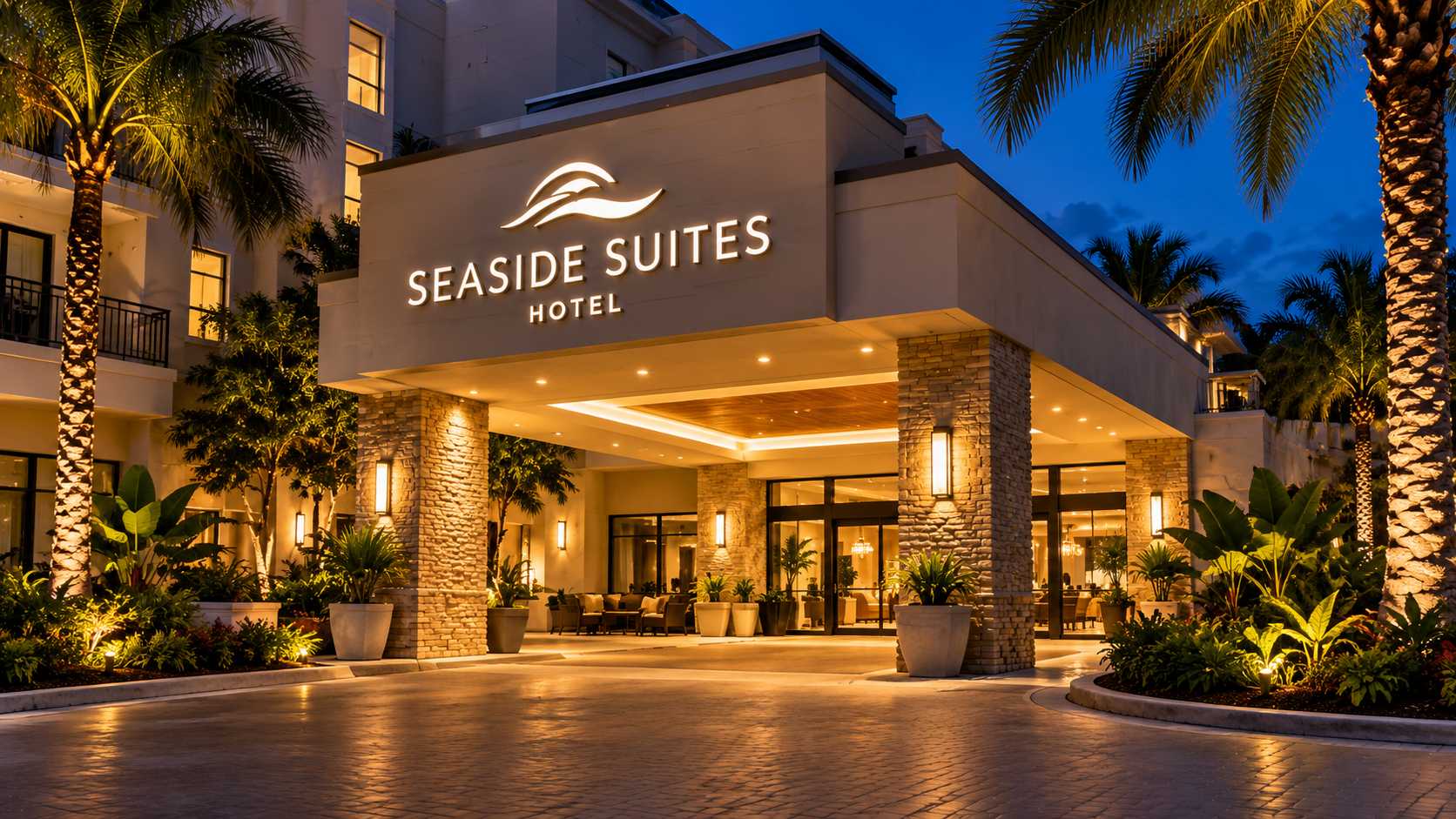
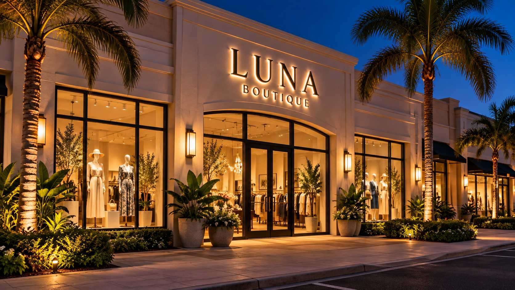
Reverse channel letters, often called halo-lit letters, create that second effect. Light is directed behind the lettering, where it reflects onto the mounting surface and outlines the letters with a softer glow. On stucco, stone, brick, or a smooth architectural façade, the result can feel sophisticated without losing visibility.
This type of signage works particularly well for restaurants, hotels, healthcare offices, lounges, and professional businesses that want their nighttime presence to feel polished rather than overly commercial. It can also help a storefront stand apart in a shopping center where several neighboring businesses rely on similar front-lit signs.
The visual effect becomes part of the environment. A guest approaching a restaurant does not need to think about why the façade feels warmer or more inviting; the lighting is already shaping that impression before the door opens.


Loyalty
Becomes Reality
Proudly trusted by thousands for delivering signage solutions that make businesses shine.
Restaurant and Bar Signs Have to Work Quickly
People do not always choose where to eat from a carefully prepared list. A restaurant may be discovered while someone is driving through town, walking through a commercial district, or deciding between several nearby options after arriving in the area.
That gives restaurant signs and bar signs a very short window in which to make sense. The business name has to be easy to read, but readability alone is not enough. The sign should also communicate something about the place: casual or upscale, energetic or relaxed, traditional or contemporary.
Channel letters, reverse channel signs, light boxes, window graphics, and digital signage can all contribute to that identity. The right combination depends on the building, the surrounding businesses, and the distance from which customers are likely to see the storefront.
A crowded sign often works against that goal. Too many words, decorative elements, and competing colors can make a business harder to recognize, especially after dark. In busy commercial areas, simplicity can be more memorable than excess.
Nighttime Visibility Starts Before the Storefront
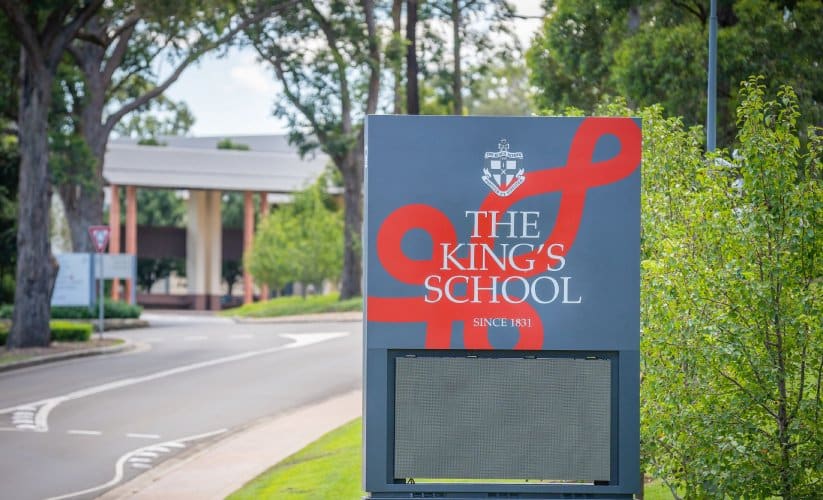
Not every business is visible directly from the road. Shopping centers, large parking lots, landscaping, and neighboring buildings can place the actual storefront far from the driver’s first point of contact. In those settings, a monument sign or pylon sign often becomes the first introduction to the property.
A monument sign can create a strong entrance while remaining visually connected to the architecture and landscaping around it. A pylon sign takes a different approach, using height to establish visibility from farther away. For commercial centers in Fort Myers, Cape Coral, and other parts of Southwest Florida, that extra reach can be especially valuable when traffic is moving quickly, or the building sits deep within the property.
At night, illumination changes both sign types again. Tenant panels need enough contrast to remain readable, but the overall structure should still feel organized. A shopping plaza with every panel competing for attention can quickly become visual noise, while a carefully designed sign can make several businesses easier to find at once.
Digital Signs Work Best When They Know When to Stop
Digital signage gives businesses freedom that traditional signs cannot offer. A restaurant can change its promotion, a church can announce an upcoming event, and an entertainment venue can update its schedule without replacing the physical sign.
That flexibility, however, creates its own temptation. When a digital sign can display almost anything, it is easy to display too much.
The most effective digital signs are often the simplest. A short message, strong contrast, and enough display time to read comfortably can communicate more than a rapid sequence of promotions. Drivers and pedestrians have limited attention, especially at night when reflections, headlights, traffic signals, and other illuminated signs are all competing for the same field of view.
In that sense, good digital signage follows the same rule as good permanent signage: clarity comes first.
Commercial Signage Should Feel Different From One Business to the Next
A nightclub, a medical office, a restaurant, and an apartment community may occupy the same commercial corridor, yet their signs should not speak in the same visual language.
Hospitality businesses may benefit from warmth and atmosphere. Healthcare signage often needs to feel clear, calm, and trustworthy. Apartment communities may use monument signs to create a sense of arrival, while churches often need signage that combines visibility with practical guidance for visitors entering the property for the first time.
This is where generic solutions begin to fall apart. The right business sign in Fort Myers or Naples should respond to the customers, the property, the architecture, and the way the business operates after dark.
Even two restaurants on the same street may need completely different solutions. One may depend on reverse channel letters and restrained lighting, while another may need bold front-lit lettering and a digital display for changing promotions. Good signage does not begin by choosing a product. It begins by understanding the place.
Florida Weather Changes the Long-Term Picture
Nighttime performance is only part of the story in Southwest Florida. Exterior signs also have to live through strong sun, humidity, heavy rain, heat, and, in coastal areas, salt exposure.
Those conditions gradually reveal the difference between a sign that was designed only to look good at installation and one built for long-term use. Finishes, electrical components, illumination systems, mounting hardware, and access for future maintenance all influence how well the sign ages.
For illuminated signage, maintenance deserves particular attention. A beautiful sign loses much of its impact when individual letters begin to dim or when one section of a light box becomes noticeably weaker than the rest. Designing for future service can make repairs simpler and help preserve a consistent appearance over time.
The Florida climate is unforgiving, but it also makes quality easier to recognize after a few years.
Permitting and Installation Are Part of the Final Look
The creative side of signage gets most of the attention, but a finished sign depends just as much on what happens before installation. Sign dimensions, placement, electrical work, structure, and illumination can all affect permitting requirements. Shopping centers may also have their own criteria for storefront lettering, tenant panels, colors, and sign size. Bringing those constraints into the project early helps avoid redesigns after the visual concept has already been approved.
Professional sign installation is equally important, particularly with illuminated signs mounted high on a façade or larger freestanding structures such as monument and pylon signs. Alignment, mounting, electrical connections, and service access all contribute to how clean the final result feels.
When those technical details are handled correctly, the customer rarely notices them. The sign simply looks as though it belongs there.
Southwest Florida After Dark Tells You Which Signs Are Working
The evening can be a surprisingly useful test. Drive through a commercial area in Fort Myers, Cape Coral, or Naples after sunset, and certain businesses remain immediately recognizable while others almost disappear. Some signs become clearer once illuminated; others become harder to read because the lighting is uneven, the contrast is weak, or too many visual elements are competing at once.
The best signs do not necessarily dominate the street. They create recognition at the right distance, support the character of the business, and make the property easier to understand.
That is particularly important for businesses that depend on evening customers, but it matters for every commercial property. A medical office may be closed, yet its illuminated name continues building familiarity. An apartment community remains visible to prospective residents driving through the neighborhood. A church sign continues communicating with the community long after the final service of the day.
Commercial signage keeps working when the building itself becomes quiet. That’s why a strong sign starts long before installation. Loyalty Signs works with commercial clients throughout Southwest Florida to bring signage projects from concept to completion. That includes a broad range of sign types such as channel letters, reverse channel lettering, monument and pylon signs, light boxes, interior signs, and digital displays